What’s the Heart of Ellsworth Logo All About?
We’ve gotten that question more than once here at Heart of Ellsworth: “What’s the logo all about?”
While some Ellsworth locals have figured it out, we thought we’d bring everyone in on the story behind the logo and what it represents.
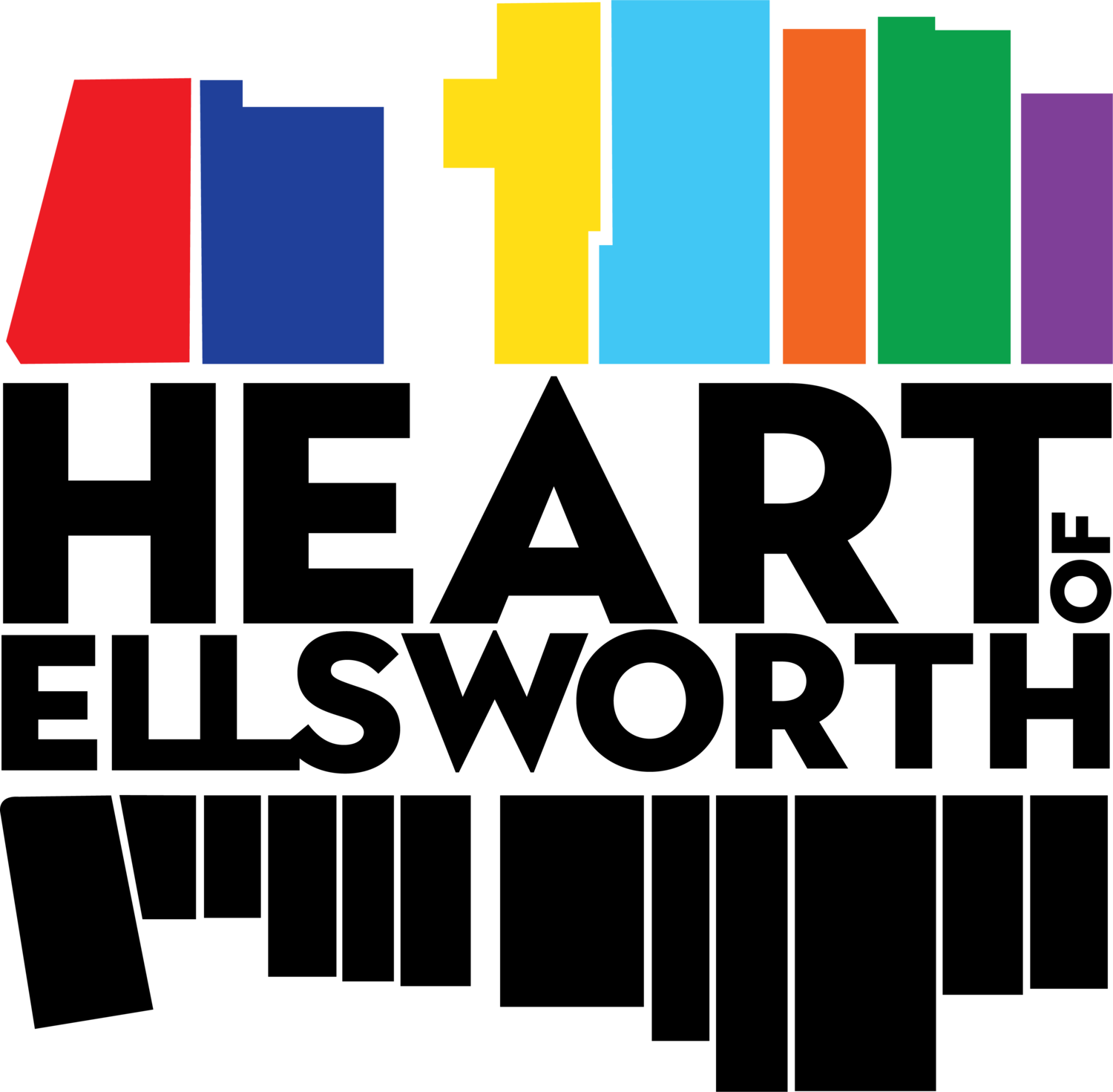
It started in 2016, when we began working with local graphic designer, Maggi Blue. Our goal was to create a logo that was unique and would stand out from those of other downtown logos. We didn’t want the standard front view “streetscape.” Instead, we wanted a design that was contemporary and abstract, yet gave us room for growth.
Our discussions centered around showing depth and showcasing our downtown – the businesses, buildings and streets that make Ellsworth, Maine, so special. We decided to address the design challenge literally, using simple shapes to connect the logo to the layout of Main Street.
Taking inspiration from an aerial view of downtown Ellsworth from Google Maps, we sketched an outline of buildings from the top of Main Street to the bottom, where Water, State and Main Streets meet. Maggi took that sketch, gave the buildings color, and used a design element to make the logo pop. She placed the Heart of Ellsworth name in the middle to signify our purpose of uniting businesses, organizations, community members and visitors.
The varied colors of the buildings used in the logo is also significant — representing the diversity of people and businesses that make up our wonderful downtown, and highlighting the open and welcoming nature of our city.
As mentioned, the logo gives us room for development and growth, allowing us to add further context and content to the graphic as Heart of Ellsworth and our downtown continues to grow.


